Introduction
Before Content Is Judged, Structure Is Judged
Before readers evaluate your ideas, they evaluate your structure.
They do this subconsciously.
Margins. Spacing. Typography. Alignment. Visual rhythm.
Within seconds, a reader decides whether your work feels intentional — or improvised.
Most creators focus on writing, tools, or software. Yet their content is judged long before any of that matters.
Layout and visual identity are not decorative layers added at the end of a project. They are structural systems. When defined early, they reduce friction, improve readability, and build trust.
This chapter explains:
- Why rules must come before design
- How layout shapes first impressions
- How visual consistency builds authority
- How to think in systems rather than aesthetics
If you prefer to see the core ideas explained visually, the short video below walks through the foundation of layout and visual identity.
Section 1 – Layout Defined
The Architecture Behind Readability
Layout is structure.
It determines:
- Where the eye goes first
- What feels important
- What feels overwhelming
- Whether reading feels smooth or strained
When the layout works, it disappears.
When layout fails, readers feel it immediately.
Think of layout like architecture. You don’t admire the beams and framing — but without them, the building collapses.
Strong layout provides:
- Predictable margins
- Consistent spacing
- Clear hierarchy
- Comfortable line length
- Intentional white space
Weak layout creates fatigue. Even excellent writing becomes harder to process when structure fights the reader.
Layout is not style.
It is an order.
Section 2 – Visual Identity Defined
Consistency Before Creativity
Visual identity is often mistaken for logos or branding elements.
Visual identity is a system of repeatable decisions.
It answers one question:
Does this feel consistent?
When readers encounter your work — blog, book, PDF, or slide — familiarity should come before recognition.
Consistency builds trust faster than creativity.
When fonts shift, spacing changes, or design elements fluctuate from page to page, readers never fully settle in. They may not consciously articulate the issue, but they sense instability.
Visual identity creates stability.
And stability creates authority.
Section 3 – Rules Before Design
Why Most Creators Get Stuck
Most design frustration does not come from a lack of talent.
It comes from skipping the definition.
Creators often open a tool first — Canva, InDesign, Word — and begin adjusting fonts, margins, and colors in real time.
That approach leads to endless revision:
Change a font.
Adjust spacing.
Try a new color.
Undo.
Start over.
Without rules, every decision feels open-ended.
Professional design is rarely about artistic brilliance.
It is about making a small number of decisions once and reusing them consistently.
Define margins once.
Define typography roles once.
Define spacing once.
Then focus on content.
Rules do not restrict creativity.
They protect it.
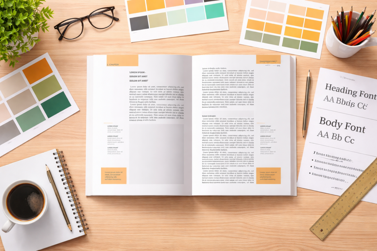
Section 4 – Structural Elements (Brief, Essential Definitions)
Now let’s move from principle to structure.
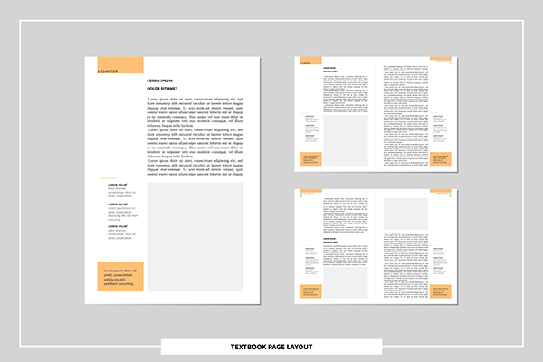
Below are the foundational layout elements every self-publisher must understand.
Trim
The final physical size of a printed book.
It defines the outer boundary — the edge where the paper is cut. Everything inside this line survives. Everything outside disappears.
Trim defines the container.
Margin
The space between text and the trim edge.
Margins provide breathing room and protect readability. Without sufficient margins, pages feel crowded — even when the content is strong.
Margin protects comfort.
Bleed
An area that extends beyond the trim line.
Bleed ensures that background colors or images reach the edge after printing. Without bleed, thin white slivers can appear along borders.
Bleed protects precision.
Gutter
The inner margin where pages bind together.
As page count increases, gutter space must increase. Otherwise, text can disappear into the spine.
Gutter protects access.
Safe Zone
The area inside the margin where critical content should remain.
Headlines, page numbers, and important images should stay within this space to prevent trimming or binding interference.
Safe zones protect your message.
Live Area
The functional working space of the page.
This is where your typography aligns, where images sit, where rhythm develops.
This is where structure becomes an experience.
If you want to see these elements demonstrated visually — including how page count affects spine width and gutter expansion — the instructional video below walks through the process step by step.
Conclusion
Structure Precedes Style
Layout and visual identity are not decoration.
They are systems.
When those systems are clear, readers feel it. Pages feel stable. Content feels intentional. The message feels trustworthy.
When systems are missing, inconsistency quietly erodes credibility.
Templates exist because structure works.
Grids exist because rhythm works.
Brand guides exist because repetition builds recognition.
Before choosing fonts.
Before choosing colors.
Before designing covers or thumbnails.
Build structure.
Once the structure is defined, design becomes faster, clearer, and more confident.
Structure creates trust.
Coming Next: Blog 14 (Chapter 14)
Reader Defines Usable Typography and Color System
After reading Blog 14, you should be able to:
- Choose a functional serif/san pairing
- Create a simple typographic hierarchy
- Define a 3-color palette
- Create a 1-page internal style guide
- Avoid over-design
In the video series, we next explore the structure of writing.
In the blog series, we move deeper into typography and color systems.
Precision sustains the trust that structure creates.
Consistency compounds authority.